The dark side plays tricks.
Dark patterns are user interface design tricks designed to manipulate you into doing things you don’t intend. The tricks benefit the author of the webpage or app at your expense.
Microsoft OneDrive is a great example. It makes many attempts to get you to back up — which seems like a good thing — without clearly informing you of what will happen to your data, even to the point of possibly causing data loss.
Let’s identify how to recognize and avoid some common forms of dark patterns.

Beware dark patterns
Websites and apps use dark patterns to get you to do things you don’t mean to do, like signing up for charges, missing hidden costs, or turning on features without knowing what they really do. Once you know what to look for, you can protect yourself by paying close attention.
Dark or deceptive patterns
A more detailed description via Wikipedia:
A dark pattern (also known as a “deceptive design pattern”) is a user interface that has been carefully crafted to trick users into doing things, such as buying overpriced insurance with their purchase or signing up for recurring bills. User experience designer Harry Brignull coined the neologism on 28 July 2010 with the registration of
darkpatterns.org, a “pattern library with the specific goal of naming and shaming deceptive user interfaces”. The website has since moved to deceptive.design. In 2023, he released the book Deceptive Patterns.
The basic idea is that instead of designing an interface to help you accomplish your goals, the designer weaponizes psychology and interface conventions against you.
Once you know what to look for, you’ll see it everywhere.
Examples of dark patterns
Here are nine of the most common types of dark patterns you’ll encounter on the internet or on apps.
Related

Don’t Fall for It: Social Engineering and How Scammers Hack Your Brain
Think you're too smart to fall for a scam? Think again. Scammers aren't targeting your intelligence; they're targeting your humanity. I'll share the sneaky mind tricks they use every day and help you spot the red flags before it's too late.#190031
Roach motel
“You can check in any time, but you can never leave.” These are services and products that are nearly impossible to cancel once you’ve signed up. Gym memberships and streaming services do this by hiding the cancel button. For a while, The New York Times required that you call and talk to a person to cancel your subscription — not only making it difficult but giving them the opportunity to try to convince you otherwise.
This is a hard one to avoid, other than taking the time to locate or research the cancellation process before you subscribe.
Hidden costs
Say you decide to purchase some product at a quoted price. Great! As you go through the checkout process, you find that additional charges have been added. Some may be optional but default to being added, while others just appear. The result is that if you complete the purchase, you will pay much more than the originally quoted price.
Pay attention to the checkout process, uncheck any optional items you don’t need or want, and if there are additional charges that you don’t understand, cancel the purchase.
Confirmshaming
When you say “no” to an offer or unsubscribe from something, you may be presented with a final confirmation button that shames you for making the decision. For example, declining an offer includes a button saying something like “No thanks, I don’t want to save money.”
Make the decision that’s right for you regardless of what the button says.
Misdirection
A great example of a dark pattern is to make the “accept all cookies” button big and colorful while the “decline” option is tiny gray text. Some newsletter or commercial email subscriptions do the same thing with the “unsubscribe” link.
Pay close attention to what’s on the screen, regardless of its size or color.
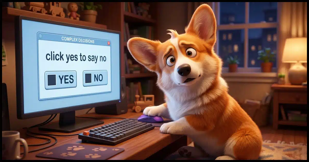
Trick or confusing questions and options
Dialog boxes can be so confusingly worded that you’re not sure what they’re asking. For example, an unsubscribe page has a checkbox labeled “Yes, I don’t want to unsubscribe”. It’s natural to check the box to unsubscribe, but the reality might be the exact opposite.
Once again, pay close attention to the wording of the various options you’re presented.
Forced continuity
Say you download a free tool and use it for a while, only to discover that it was a free trial, and you’re now forced to pay a subscription in order to keep using it. Some programs are upfront about this, but often hide a truly free alternative; others are less clear. You may need to decide whether to pay or not, or whether or not to dispute an unexpected credit card charge.
The theme continues: pay close attention to wording as you download any software or make other purchases.
Related
")
Never Blindly Trust an Online Recommendation (Even Mine)
A snide remark about one of my recommendations raises an important point about any recommendation you find online: there are many opportunities for abuse.#5533
Disguised ads
This is as old as the web, I think. Everything from complete articles and other content can be designed to look like independent content, only to have been “sponsored” (explicitly or otherwise) by a third party with an agenda. It’s not an article; it’s an advertisement pretending to be information.
Be skeptical of everything you read. Pay particular attention to whether or not the website has an agenda, paid or otherwise.
Disguised ads #2
Download buttons. You’ve probably seen product pages plastered with download buttons that are easily mistaken for the ‘real’ download button for the product you want. Click the wrong one, and you’re taken to another product, or worse, you download some other product without realizing it. Those download buttons were all ads.
Look for the little “ad” symbol or other indication that a button is an ad, and carefully locate the One True Download button for the software you want.
Incomplete information
This is the one that bugs me the most, and the one for which the OneDrive backup “feature” is the greatest offender. The service is offered as a backup, which, of course, people like me frequently insist is an absolute necessity. And yet OneDrive’s backup, while useful if you understand it, isn’t a true backup, and turning it on has massive implications that simply aren’t described. The material recommending you turn it on sidesteps the major ramifications of doing so.
This can be difficult to discover before enabling a feature like this, but to the best of your ability, research so you know what you’re getting into.
Do this
Sometimes these situations are just bad design that hasn’t been thought through. But unfortunately, all too often, dark patterns are put there on purpose. They are deliberate techniques exploiting psychological tricks to get you to act against your own interests.
Your best defense is a strong sense of skepticism and paying close attention to what is presented to you.
Subscribe to Confident Computing! Less frustration and more confidence, solutions, answers, and tips in your inbox every week.


It would almost be easier to list the websites that don’t use dark patterns. I get lots of emails that require retyping my address. When unsubscribing takes more than 2 clicks, I click unsubscribe and click to confirm. Anything more, and I’ll mark those emails as spam. Enough spam black marks will eventually hurt a company’s reputation.
Roach Hotels: I prefer to call them Hotel Californias. 😉
You can check out, but you can never leave.
Name it however you want, everything Leo described in this item, particularly those that involve the exclusion of all the facts are actually false advertising or at the least lies of omission. I hate lies of any sort, but if you ask me, lies of omission are particularly insidious, because you may not be able to know what has been omitted until it’s too late, so you’re left holding the bag.
Sadly, this sort of using dark patterns goes far beyond the Internet. You may encounter it in phone scams, all forms of product advertising, and even into housing and automobile sales where it can prove to be exceedingly costly. The solution’s the same for everything I’ve alluded to, and that requires that you always remain very skeptical, and pay exceedingly careful attention to all the details, and when an ‘expert”s involved, confirm the expert’s certification/licensing and level of experience (e.g.: is your house inspector certified/licensed, how long has (s)he worked as an inspector, and what did (s)he do before becoming an inspector). In other words, always do your due diligence, because if you don’t, you could be left holding the proverbial bag.
Ernie
Am*zon Prime is one of the most annoying to me, it’s rammed down your throat at every opportunity, you have to be very careful at the checkout, however it is not as bad as it was a few years ago, at least the last time I or my wife accidently invoked it, it was easy to cancel.
They take your money easily at the end of a trial when you have a payment card attached to your account for making purchases.
Not surprised this process of deception has a name 🙂
You mentioned the most notorious and evil Dark Pattern. Many websites do this. They ask for your credit card and if you forget to cancel, you end up being billed when the trial expires. They bank on you forgetting to cancel.
One thing I’ve learned is: if you sign up for a trial with your credit card, immediately cancel the subscription after subscribing. In most cases, you can continue the evaluation period.
Most search engines use dark patterns. I’m looking at you Google. (others are guilty too)
https://askleo.com/is-google-forcing-everyone-into-ai-search/