What you can do to make things easier to read.
Well, to start with, Bill wouldn’t be any help at all. He’s not been involved in the workings of Windows for years. Besides, this isn’t a Windows problem, it’s primarily a website problem.
And it is a problem. It’s one I hear frequently.
Unfortunately, the remedies are either extreme or non-existent.

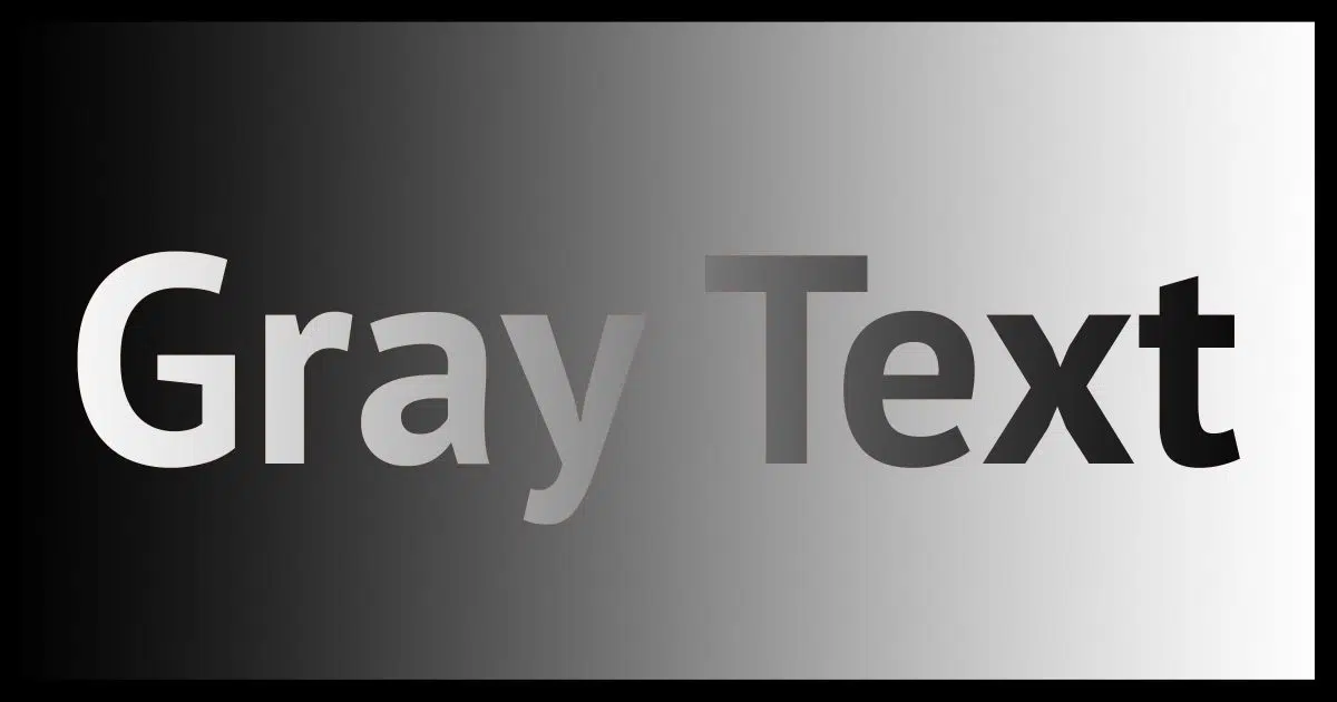
Gray text
- Text colors other than pure black are more and more common, with shades of gray being a current design favorite.
- Many people have difficulty reading text with currently popular colors.
- There’s no single suitable solution to work around these poor design choices.
- Windows has a “high contrast” mode.
- Google Chrome has a “high contrast” extension.
- Other browser extensions may help.
- Complain to individual website owners about their design decisions.
Too many shades of gray
Black is out. Gray is in. At least when it comes to text in website design, it appears.

And, of course, there’s no agreed-upon definition what color “gray” should be. Website and theme designers pick something that appeals to them and run with it (which displays differently depending on monitors anyway). The result is that you might have a light gray, a dark gray, a darker gray, or something that is so dark gray that for most people it’s nearly indistinguishable from black.
For most people. And therein lies the problem.
Help keep it going by becoming a Patron.
Gray areas aren’t always gray
For a wide variety of reasons, ranging from display brightness and contrast settings to the individual characteristics of someone’s eyesight, it’s possible for what some would consider a darkish gray to appear so light as to be unreadable to others.
For those others, only 100% black will do.
Aside from fiddling with brightness and contrast settings (which may not even be present on some display hardware) there are precious few options.
Options
There is no single approach to fixing this other than convincing website designers to stop using gray or give visitors a way to make a choice. So far, this approach seems unsuccessful. Even Google’s been called on the carpet for it, and they’ve done nothing.
At best, available tools are ugly workarounds that might make the text readable — at a cost.
Select All
This is the solution that I turn to when I run into readability issues. Click anywhere on the page in question and type CTRL+A.
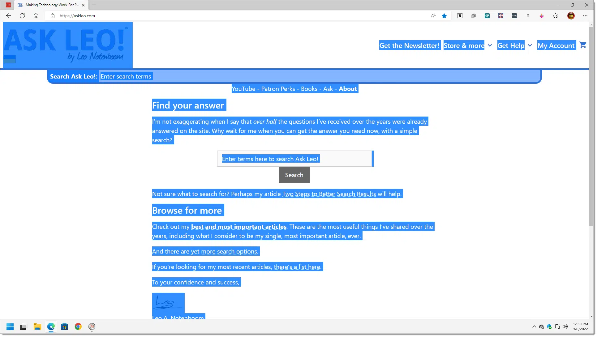
CTRL+A is the keyboard shortcut to “select all” in preparation for copy/paste or other operations. To show what’s selected, Windows highlights it in an interesting way. In the example above, the normally black-on-white text is transformed by the selection into white-on-blue. Even some other text on the screen that’s intentionally lower contrast, like the “Enter search terms” prompt in the search box, is similarly highlighted.
You don’t need to select everything. You can just click and drag the mouse over the text you’re having difficulty reading and find that it’s easier to read with the highlighting.
Many people find this enough to make the difficult-to-read more obvious.
You can click anywhere outside the highlighted text to return it to normal.
Windows high contrast
An extreme approach is to change Windows display to high contrast.
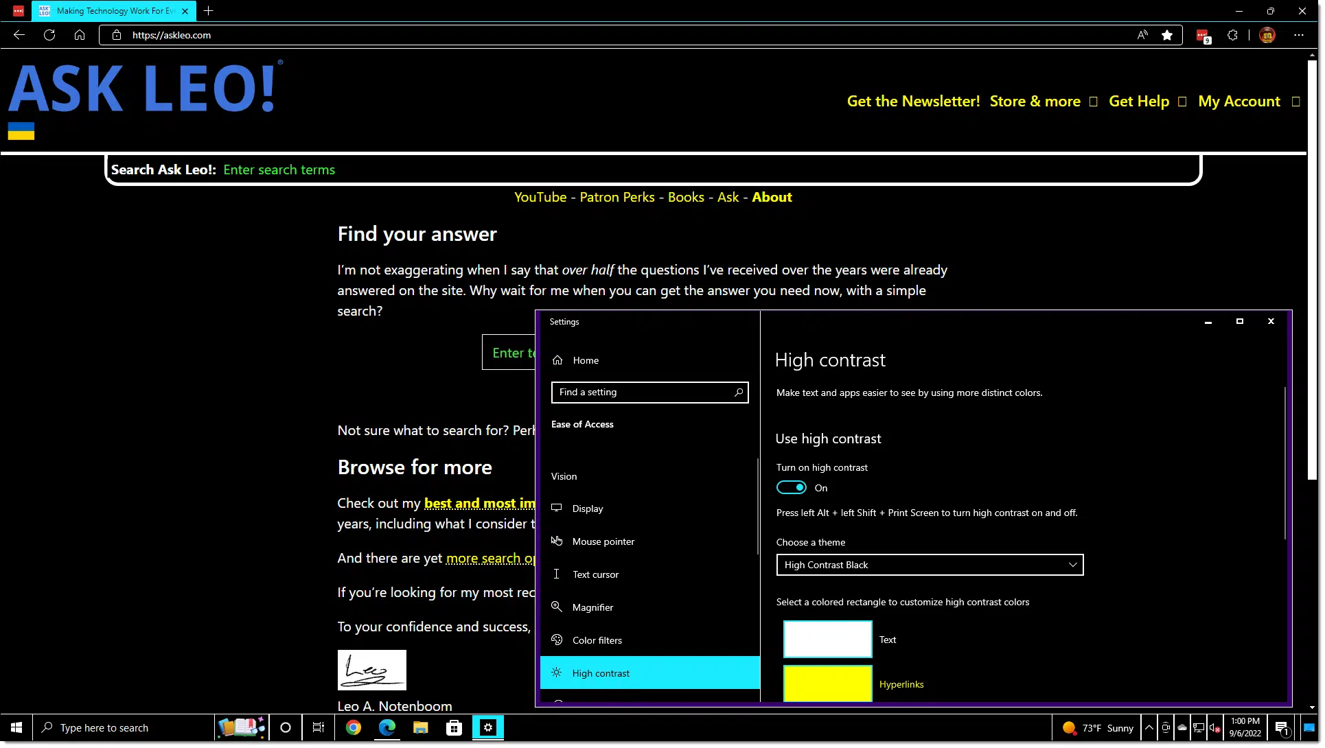
Click the Start button and type contrast.
In Windows 10, click on Turn high contrast on or off when it appears in the results. That’ll open the high-contrast settings. Turn it on, and your entire screen will change.
Yep, that’s ugly. Readable, but ugly.
Windows does include some variations on the high contrast settings you can play with (High Contrast #1, High Contrast #2, High Contrast White, and High Contrast Black, shown above). None of them are pretty, but they are readable.
In Windows 11, click on Contrast themes when it appears in the search results. In the resulting settings window, click on the drop-down at the right of the Contrast themes setting.
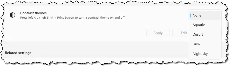
Select the theme version you want to use and click Apply.
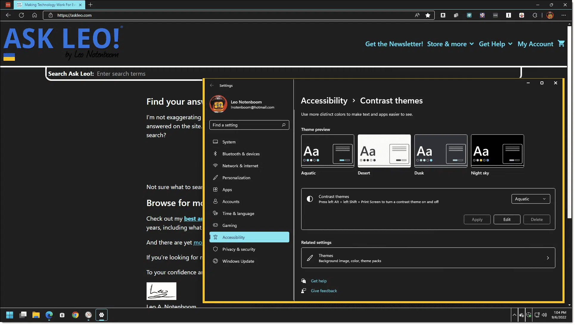
As with Windows 10, there are variations of the high contrast theme to experiment with.
Depending on your circumstance, this may or may not actually help; websites can explicitly specify colors that bypass the Windows settings. Similarly, images may not be altered.
Google Chrome high contrast
If you use Google Chrome, there’s a high contrast browser extension.
When installed and enabled, it controls the look of the webpages displayed in your browser.
Once again, it might not be pretty, but it works. In this case, of course, it’s limited to what’s displayed in your browser window — note that the Windows Start menu is unaffected above.
The Google Chrome extension includes additional approaches to play with, including Increased Contrast, Grayscale, Inverted Grayscale, Yellow on Black, and Inverted Color (shown above).
Similar extensions appear to be available for Microsoft Edge.
Dark Reader
Suggested in the comments below, Dark Reader is another browser extension that can also help improve readability. Its intent is to provide a “night mode” reading experience.
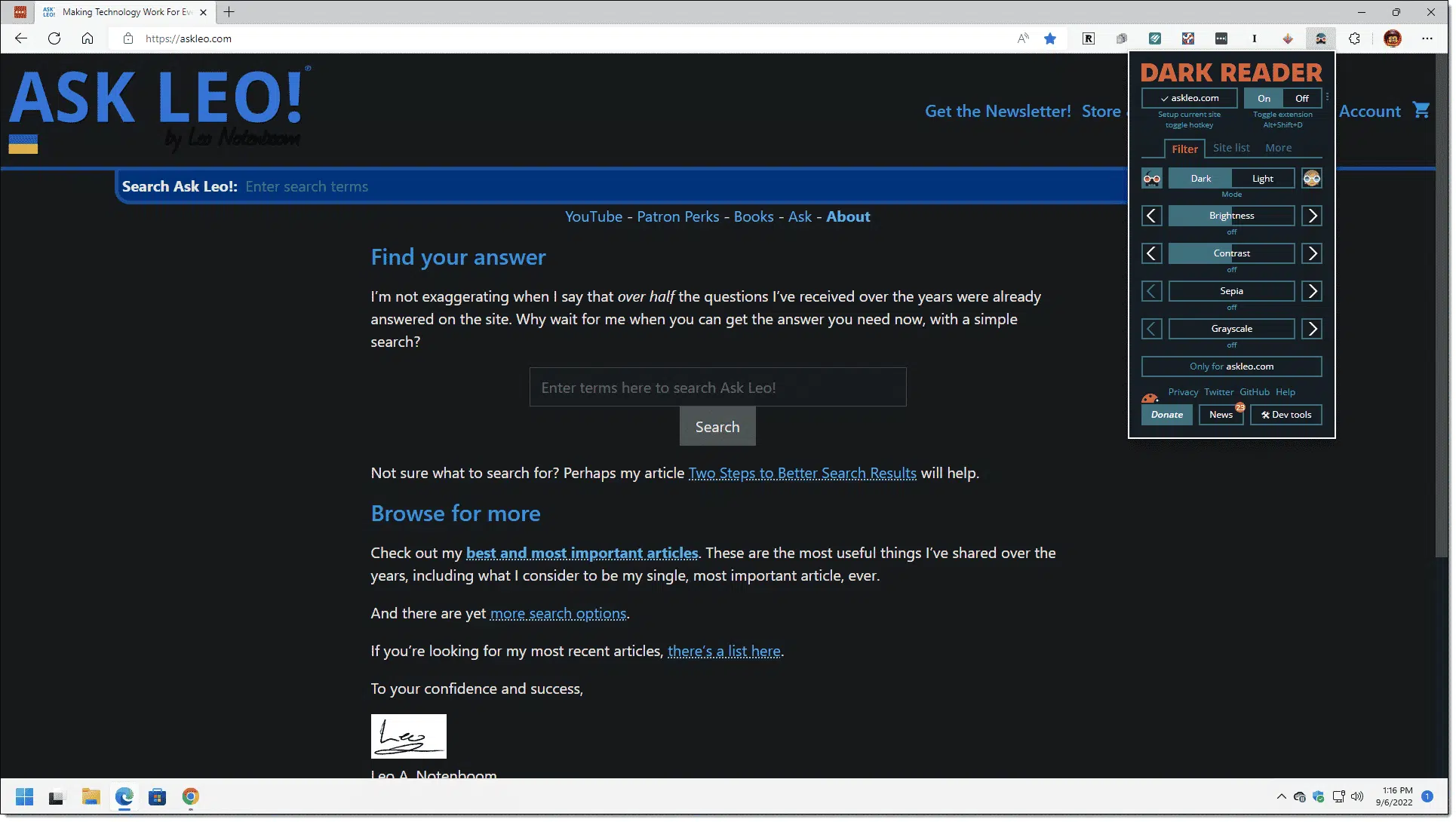
That alone may be enough to make things more readable. Dark Reader includes additional controls to adjust brightness, contrast, and colors that may help further.
Do this
Know that you are not alone. Grey fonts are a problem for many people.
And the problem might not be evident to everyone. One thing you can do is let website owners know about your experience.1 While they might not address it based on a single complaint, if enough people let them know, perhaps, maybe, they’ll take heed.
Unless, it appears, they’re Google.
I try to keep my newsletter readable: subscribe to Confident Computing! Less frustration and more confidence, solutions, answers, and tips in your inbox every week.
Podcast audio

Related Video


Footnotes & References
1: An early design of Ask Leo! that I commissioned used what I thought was black but was actually a dark gray. It wasn’t until a reader pointed out the problem to me that I confirmed and fixed the issue. Everywhere, I hope. The complexity of website design is another reason issues like this are sometimes difficult to correct.

One of my biggest beefs, especially when it happens on a news, or tech site. How this looks to the Dev, or writer, is not always how it presents to us as readers unfortunately. When I create things, I am often surprised at the difference between what is on my screen when I create the content, and the finished product that people see on the web.
I live in New Zealand and used to work for a Government Department. Was in a team that worked in with the IT and Web team, and the one thing they always did was develop a basic page of what they were going to do and then use a test machine to see what it looked like in various browsers, and on not only Windows, but also Macintosh and Linux as well.
There aim, not always 100% successful, was to have live web pages look visually identical on all 3 major operating systems and the top 5 browsers on each system by usage data statistics. Time consuming? Absolutely. But they only had a handful of people complain about colour issues and as I recall they were all due to flaky or end of useful life of video cards at the viewers end.
I’m going to file an ADA complaint against all these companies such as Microsoft that have made the pale gray font default that cannot be changed. My employer just switched ovef to Windows 10 and Outlook 16 and it’s giving me a freaking hdadache.
While I do wish you the best of luck I suspect you won’t find much support from the legal community. My guess is that it’s unwinnable. Microsoft does have alternatives in place (like high contrast mode) that are intended to address this issue specifically with regard to ADA. That you may not like these alternatives doesn’t mean that they would be required to do anything more.
Hilarious! Gary T.’s response is in gray font.
Thanks for pointing that out. I (hopefully) updated the site to display comments in true black. As a site owner it’s sometimes difficult to catch all the instances of the problem.
I’ve had a similar problem, only due more to a weird problem with my eyesight. I found a Chrome extension called Dark Reader. It is far better than Stylus or Stylish theme colors overlay extensions. Dark reader makes every website “dark”. I mention it here because on its drop-down menu, you can set many different colors- including for the font on every website.
I’ll second the recommendation about Dark Reader. It has been designed to solve a different problem, but maybe it can be used against grey text, too.
It has become painful for me to stare at a white screen all day long. So I enable the so-called dark mode anytime I can.
Dark Reader is an extension for Firefox, Chrome and Chrome-based browsers. My experience has been it will produce absolutely remarkable combinations of colours on almost any site : very readable, easy on the eyes, and beautiful.
I have found that two of the pre-sets are enough to cover almost all cases : Dark / Static, and Dark / Dynamic.
Since what Dark Reader does is change the colours (especially the text colour), and provided you don’t mind a dark mode, it might be a solution to the grey epidemic, too. It has a Light mode, which replaces the dark background with a light (but not white) one.
To be frank, I haven’t even noticed there was a grey text epidemic, probably because I use Dark Reader. Oh ! and by the way, Dark Reader’s text is grey (more often coloured grey), but since it’s on a dark background (not totally black, either), it’s very, very readable.
I’m red green color blind and the trendy red on black doesn’t work for me. I’ll check out these tricks. One that’s quick and sometimes works is to click in the text a hit control A. It selects everything and makes it readable.
I absolutely agree with the abominations of low contrast. I have a form email I send to many of these sites. Few have taken my complaint seriously. We need more people to complain!
A great site dedicated to this problem: ContrastRebellion.com
ContrastRebellion backs up our complaints and opinions with usability experts, experiment reports, etc. I couldn’t make this plainer myself.
Having become one of those to whom the gray text has become a problem, I find that if I highlight that page (either using CTL-A or clicking and dragging my mouse cursor, the text then becomes highlighted against a darker background. I have just resigned myself to using this method since there are (now) fewer sites that use these color schemes. Yes, it’s sometimes a pain using a couple of extra steps, but being retired, what else is demanding my time? Plus, it doesn’t happen that often.
For several months before my cataract surgery, I used High Contrast Mode on my Win 7 PC. I also highlighted smaller areas of text to make it readable. As Leo says, it isn’t pretty, and you lose some things, but the images are still in their original form.
The Contrast Rebellion web site looks good.
I push back on feeble web sites whenever I’m provoked. So far, I haven’t found a “money” site on whom I can impose a cost, e.g. by telling them they’ve lost a sale.
I removed an off-topic hate speech political rant from the comments. We do our best to remove inappropriate content, but we all have other jobs and between the 3 of us we check in a few times a day. If you commented to draw attention to this and can’t find your comment, it’s because when a comment is removed, all responses to that comment are automatically removed with it
Thank you for your vigilance. I trust AskLeo.com more than any other tech info web site for consistent, useful, and pertinent information, and removing off-putting, off-topic comments adds to my enjoyment of the site.
I, too, am frustrated with the recent trend toward light text. Apparently graphic artists have been taught to use gray text so there’s not so much “black” on the page. The human eye distinguishes items by contrast. When there’s little contrast between the text and the background, it’s harder to read the text. I’ve found an easy solution for both this contrast problem and page clutter, by using an add-on variously called Reader View or something similar, based on which extension is used. Such extensions often let you choose a light color, black, or sepia (a tan color), so contrast is enhanced. They also show only the text on the page, without all of the other clutter. So it’s much easier to just focus on the text, with better contrast. Here’s a link to Reader View that’s found in the Chrome Web store: https://chrome.google.com/webstore/detail/reader-view/ecabifbgmdmgdllomnfinbmaellmclnh. Also, your browser may include such an extension. I use Vivaldi, which avoids Google Chrome but lets you use Chrome extensions. Vivaldi includes such an extension built in, but some pages don’t work on one or the other, so it’s nice to have both.
Firefox has several extensions that either increase text contrast or turn gray text into black.
I am sure that poor readability is intentional when the font is small grey text on slightly lighter grey background. It is used for stuff they don’t want you to read, like unsubscribe or restrictions or automatic spam sign ups. Sort of like the tiny white print that TV commercials flash for 3 seconds to meet legal disclosure requirements.
Another clumsy work around I use is to highlight the text, open Libre or Word and copy the text unformatted into it. Then I have the choice of fonts, etc.
This is clearly an evil plot on the part of the Left. Or the Right; I’m not sure. Hard to tell them apart.
I use this option as well if needed, but it’s rare for me. I sometimes just increase the font size by using control + on the computer or stretch the screen on my phone.
Some web design is almost like a 5 year old with a new box of crayons – use as many as possible. Ditto fonts.
Now they’ve discovered grey
An important note about recently removed offensive comments
Ask Leo uses an “after publish” moderation technique. That means that comments are generally published immediately, without moderation (there are some keyword based exceptions). Then several times a day I and my staff review recent comments and remove the inappropriate – almost always simply comment spam.
This allows you to participate in the discussion immediately. It does mean that offensive comments will appear for “a while”, since we can’t spend 24 hours a day watching for them.
The only solution I’m aware of would be to switch to be fully moderated – meaning every comment would have to be manually approved before it appears. Not only is that sad, but it’s a bucket of work that I can’t afford. If I ever resort to that I’ll be making other changes to how comments are handled here. The current technique has actually served us well for over fifteen years.
I apologize to anyone offended by the now removed comment(s).
Leo
Trying to moderate comments on a web site is like standing on the beach with a broom and trying to sweep out the incoming tide.
Actually it’s worse — 90% of the water is completely benign. It’s the oily residue that sometimes sneaks in. Separating the two can be a challenge.
Don’t you blacklist certain words, phrases and email addresses so that they can be filtered out automatically.
Yes, some words are blacklisted, but as with spam, you can’t catch everything. As things come up we can add more words.
Actually I don’t truly blacklist — there’s no immediate deletion based on that. There are keywords that will force a comment into moderation. The problem is that any word we might blacklist can often be used in a reasonable context, so we need human eyes on it to make the decision. Similarly links (ANY link) or email addresses in the comment will put a comment into moderation.
I also run an anti-spam service that does a pretty good job filtering out the worst automatically, though.
I agree with the comments posted by Frank Bacon. I have used the “highlight-copy- paste” into Word for may years in order to get around the unreadable
“grey” text silliness. There are other website issues where I also use this approach ; eg web pages that make it impossible to “print” or easily read the page. By highlighting and copying the relevant text into a blank word document, after which, one can alter the text to almost any style, color or font you like and then save it and/or print it out in glorious B&W.
My browser has a “Save Page As” command in the File menu with a .txt option; this can be useful when trying to save information on a web page in a compact and highly readable form.
It seems that websites are designed by really good artists. The trouble is that there are likely no coloured blind people on the review team that approve the results. One in 200 women and one in 12 men are coloured blind to one degree or another.
The worst designs often use red script on a black background. This is true for printed matter too. Then once an organization adopts these colour schemes they get married to them and any remedy takes forever to be implemented.
KISS needs to be added. If your message is important then make sure it is readable easily and quickly.
I suffered from the “gray” problem (sometimes even “gray on gray”) but found that the Chrome extension “High Contrast” solved all my problems. The “Increased Contrast” setting is the closest to whatever the website’s appearance is, but with all text appearing black on a white background. No funky color changes, just an increase in contrast, especially with text.
I think its much easier in settings, Personalization, under colors just scroll down and select “Light” instead of “Dark”
I’ve had the same complaint with the customer support discussion forums at Comcast. But then I had my cataracts done back in November, and the problem just went away. Sad to say, but yes, the grey stuff really is rough for seniors and others with a vision disability.
When I do a Ctrl + C and then paste the document. The entire document is grayed with a line down the left hand margin??
Nothing I can find will restore it to black. I am using Windows 10.
Which program are you pasting the text into? Notepad is a good choice because it is only black on white with no formatting to mess it up.
A thought on the problem of fonts that are unreadable by persons who are color-blind: They may violate the Americans with Disabilities Act. The prospect of damages, plus attorney’s fees, might get some folks’ attention.
I blog on WordPress.com. Even the free plans now allow writers to customize the appearance of each site, including the color and size of the text. My main site now has a white background with definitely black text in my preferred Verdana font. I was also able to change another one of my sites to a “high contrast” theme with a black background and white or bright colors for the text. Thank you, WordPress!
Thank you, thank you, thank you! I thought I was alone in hating these gray fonts. Contrastrebellion.com is a great addition to my bookmarks. I will immediately add on one or more of the recommended extensions.
Twenty-two years ago I wrote a program which spit out hundreds of web pages to display the 140 “named colours” supported by web browsers, in a variety of ways. Even today, different browsers display many of those colours differently. At that time, I categorized honeydew, oldlace and linen as shades of gray, (based on the Windows Explorer of the time) but modern browsers have fixed them.
Would you believe that “lightgoldenrodyellow” is probably hard-coded into your browser? That’s how I built the list, by dumping “explorer.exe” in hex and character form.
Bottom line on gray type: There’s no accounting for taste!
Many people in charge of web “design” are in fact simply web “builders” who may very well be adept at making sites WORK, but not very skilled at making them attractive or readable, two VERY important characteristics.
What good is it to assure that all the links on a site perform as they’re supposed to….if you can’t READ them?
What’s the point in having hard-hitting sales copy if it’s created in white type on a yellow background? (Arguably worse than gray on white.)
Smart site builders have a special person or sometimes an entire department in charge of “look and feel”, but, alas, both “looking” and “feeling” are as prone to individual subjectivity as form and function!
In short, web design is like everything else. There’s GOOD….there’s BAD……and there’s the truly DIS-FUNCTIONAL.
Whenever I encounter text color or contrast problems on the web, one “workaround” fix I will immediately try is to right-click in a blank area of the web page, and then click “select all.”
All text on that web page is instantly highlighted — in Windows 7, at least, in an inverted white-on-blue font — which is ugly but usually MUCH more readable than the website’s own choice.
Hope this is of help…
There is too much on this page for me to read, however, I think that Apple are among the worst offenders.
All the paper work supplied with their sold products, iPhones, iPad etc is in this form, pale grey text on white paper. Completely unreadable.
In response to BobD’s comment I have recently changed my Power Supplier from Scottish Power to Octopus and I informed them that the reason I was changing supplier is because it is impossible to read their website because of their exceedingly poor text colour choices, for example yellow text on a pale green background. In conversation with their customer services I told them it didn’t matter how many offers they made me for cheaper power unless I could see my account the whole thing was pointless……..
The simplest and quickest fix is to hit CTRL-A or select All and this highlights and contrasts the text without having to change settings. You can also highlight with your mouse.
If you use Chrome browser, navigate to the Chrome Web Store and add the extension Font Rendering Enhancer. I’ve been successfully using it for years on my Chromebook laptop and it has a 5-star rating.
“Font Rendering Enhancer for Chrome. Darker and clearer text on the pages (http and https).
Description:
Font Rendering Enhancer comes from Opera Font Rendering by thunder13. Darker and clearer text on almost every page (http and https). Modified and ported Mac OSX Font Rendering by proxxy (from Opera on Presto engine).”
I was very hopeful that Font Rendering Enhancer would work for me because I use Chrome a lot. However, installing it made no difference even though I moved the font width slider from 0% to 100% and back again, and refreshed pages after each slider movement. Web sites checked included Wikipedia (which normally looks just fine), hackernews.com (which uses quite faint text; mentioned at contrastrebellion.com), and Google search results.
BTW, the extension was last updated in 2014. The web store says the extension is compatible with my device.
Am I doing something wrong?
I’m not quite sure … I’ve had the extension for years without entering the options but checking now, all I’m seeing is the slider to move the font thickness. Whereas when I installed it, there were several options including choosing a specific font from a list for webpage rendering, some fonts being much easier to read. And this continues working on my extension, even though it appears the option is no longer available, thus I assume the ease for me of reading webpages continues from a prior setting that continues. I wear glasses for nearsightedness; for reading they are terrible. This is why my laptop is so good because I can read it without the glasses. So … when you are on the Font Rendering Enhancer page, there will be a link for similar extensions. See if anything else they have will work. It’s very easy to try and remove all of theses Chrome extensions.
Are the Chrome extensions available on an iPad? I can’t find them here if they are. I deal with four machines and three or more browsers usually but if I could do just one thing to help the grey on gray problem I’d use it a lot.
Chrome extensions require the Chrome browser, which is supported on iOS 10 and higher on iPad, iPhone, and iPod Touch:
https://support.google.com/chrome/answer/95346?co=GENIE.Platform%3DiOS&hl=en
I believe that the Chrome extensions should work if you install the Chrome browser on your device. However, you’ll have to test to be sure.
re….am desperate and angry over the “trend” in graying fonts
Why is the word trend in quotes?
Why is such a trivial issue enough to cause such severe emotions?
Because for many people it is not a trivial issue at all.
If web designers want users to be “sticky,” to stay engaged, to keep reading, they will not make it tiring to spend time reading.
Here’s another commentary on this trend:
“It’s been getting harder for me to read things on my phone and my laptop. I’ve caught myself squinting and holding the screen closer to my face. I’ve worried that my eyesight is starting to go. These hurdles have made me grumpier over time, but what pushed me over the edge was when Google’s App Engine console — a page that, as a developer, I use daily — changed its text from legible to illegible. Text that was once crisp and dark was suddenly lightened to a pallid gray. Though age has indeed taken its toll on my eyesight, it turns out that I was suffering from a design trend.”
https://www.wired.com/2016/10/how-the-web-became-unreadable/
Hi guys, check out “No Squint Plus” if you have Chrome. It has a ton of global and per site settings like change BG and text color, change visited link color, font sizes, full page zoom, and very friendly interface.`
There are some very good points regarding the issue of the (not very well thought out) use of grey text on web-sites in these comments.
As a die-hard XP user (because all my software works) I have found the best answers to the problem to be:
1. Using Shift/Alternate/Print Screen to get into high contrast mode.
2. Highlighting the text with the mouse and as several people have done, copy and pasted it into a word processor where one can change the text (font size and colour) to suit visability.
I can also save the text for later reading, especially if it is an article I want to read later.
My own gripes (without wanting to derail this thread) is the use of yellow text on white, which makes web pages (and indeed a lot of software) unreadable and unusable.
Also the text is far too small.
The world seems to believe that ‘smaller is better’. However, those of us who are older are unable to see tiny things, however good their eye-sight is.
My personal problem has been cataracts. Only one eye was operable, the other is redundant. I am also highly (and I would not be alone) photosensitive, which make white pages very difficult to view.
These are all areas which need to be looked at by self-called ‘web designers’. They need to be aware that not evryone has 20/20 vision.
This leads, on commerical sites, to a considerable amount of lost revenue for their advertisers, as there are a plethora of older people who pass over sites that cannot read their wares, and possibly have the money to buy them.
THANKS for the tip!!!
Shift/Alternate/Print Screen works on Windows 11. It helps a lot.
Speaking of grey font, like the ones used in this article (ironic I think) I’ve even seen this insidious diabolical web design turn up on printed documents and other ink on paper articles, it’s some sort of conspiracy against old people or something, I guess they think that if people people of a certain age can’t read the fonts they can’t be informed of current events especially those of a political variety.
Trouble is it’s not just old folks that can’t see these damn fonts! Damn fools.
It’s not a conspiracy. It’s just clueless younger web designers who have no idea that people with poor eyesight exist 🙂
For the record, the fonts in this article (and all of Ask Leo!) are set to black. I just double checked. Can’t make ’em any blacker.
I see a grey font and I want it painted black. No colors anymore I want them to turn black.
Ha! For the few who might miss the reference: https://www.youtube.com/watch?v=zHOA3DJyd6U (with a very young Mick Jagger)
Great link. I watched it live on TV when I was a teeenager.
Its probably better to have black as the standard default and then people that find it hard to read can move over to something grey. It would be interesting to know how many people would prefer grey.
I have good eye sight but grey is a very bad idea.
My guess would be that the only people who prefer grey are poor web designers. 😉
I have this problem across the entire Win 10 system. Explorer, drop down menus, documents, you name it. I wonder why some people- web designers – use pale blue and pale yellow text against white background. Absolutely blinding and unreadable. Same with icon text. Unless the background is pretty dark the white text is invisible.
When using Firefox version 76, click the hamburger and select «options». In «Languages and appearance», «Font and colors», «colors…» button.
In «Override colors specified …», change the selection to «Always» and click OK.
Now, your choice will always replace the colours set by the web page. The effect is immediate.
The Google Chrome extension is great. My university uploads scanned copies of the teachers’ books. That’s not even gray on white. It’s more like gray on light gray. Normally, that’s not a problem but today I wanted to view it on an older laptop with a weak screen. I installed the high contrast extension and it was perfectly readable in white on black.
My parents found this extension: https://chrome.google.com/webstore/detail/make-chrome-text-black/hlihhjmofodfndfnpjlcabdaimecephb. They didn’t like the high contrast extensions and most of the other text color changers weren’t usable.
Funnily enough, it’s literally called “Make Chrome Text Black”. It does the job. They haven’t had any problems using it (yet!). This makes me happy as well, considering I’m their tech support hotline.
The only thing is that it costs $20 a year. Not sure why everything is a subscription service these days.
2021 March: I’ve discovered settings in both Thunderbird and Firefox to override the sender’s or website’s fonts with my own defaults, without having High Contrast settings in place. Now I get black on white, everywhere. Next project: Hunt out the settings in Android versions of e-mail and browser.
*** For websites, I’d been relying on PrintFriendly to generate consistent PDF output. This not only eliminates visual gunk, and lets me choose what else to delete before generating the PDF, but it defaults to simple black on white. (Sadly, Firefox eliminated PrintFriendly from the Android app. My tablet is now unusable for most of my web browsing.)
*** Worst case: I try to enlarge the unwelcome gray font until it becomes more readable.
Ironically, the comment box on this site has gray text. 🙂
I ended up making a bookmarklet that snaps all non-link text to black or white (depending which is closest) and to blue for links. You can just drag the bookmarklet to the address bar, and click on it at any time. Some sites end up looking ugly. http://alexanderpruss.blogspot.com/2021/05/contrast-and-times-new-roman.html
I’ve also made a very Chrome extension that snaps all text colors on all sites that are close to black to full black. You get to specify how close. There is a tradeoff. If you set the distance low, then lighter grays survive. If you set the distance high, then you lose the distinction between black/dark gray and light gray that some sites use for semantic purposes (e.g., to mark less important text, or to mark links). https://github.com/arpruss/blacker
By the way, my extension is now in the Chrome web store: https://chrome.google.com/webstore/detail/blacker/nmmmdgooonmibfppcponjkaoohgcdpbd
I had to turn it up to 45% “blacken range” to get this textbox, though.
I checked it out and this extension can be installed on other Chromium browsers, Chrome, Edge, Brave, Opera, and more.
And I ported it to Firefox, too: https://addons.mozilla.org/en/firefox/addon/blacker1/?utm_source=addons.mozilla.org&utm_medium=referral&utm_content=search
One problem is Google Chrome, compared to other browsers, like Slim Browser. Chrome shows black text in GREY, compared to the pure black in Slim Browser. Try it. Big difference, using same font family.
So, it’s not a website problem in this case. It’s a browser rendering issue.
I tested the “Change Colors” extension which lets you specify a color for text and background. Setting background to FFFFFF and text color to 00000, does not change the black level of text AT ALL in Chrome. What were the “phd” “genius” Chrome designers thinking? Why don’t they respect website (and reader) choice of “black” text?
Using Chrome Version 94.0.4606.71, 64bit. And I’m about to ditch this browser due to this one issue. I already ditched Edge after only a day of first use, due to another ever-in-your-face big bother for which no solution was found.
My approach is to give a verbal dope slap to every web designer I meet who is too stupid to do something other than follow a now-no-longer-trendy trend. No, they don’t like it. Some of them are embarrassed enough to pay attention. And, by the way, I see gray-on-white in this very edit box I’m typing in. Consider yourself dope-slapped.
This goes to show how difficult it can be for the web designed to dot all the i’s and cross all the t’s. I’ve worked hard to make life black-and-white here, and yet things inevitably slip through.
Leo, sometimes I enlarge the size of the font, which makes it darker and a little more easy to read. Interestingly I see that this comment box is set for light gray.
Several yrs. ago, I literally stumbled upon a solution I have shared with friends. As I am employing Win7, I have no idea if later OPs have this ability.
Left click VIEW in the extreme upper left.
Left click ENTER READER VIEW in the drop down menu.
There have been so few sites for this to not work, the only one I recall is the NY Times. ALL ads are removed and lettering is in black on white.
The trend for web sites to switch from black fonts to “50 shades of grey” is not the only thing impacting readability! Many are also using fine, almost hairline fonts + pastel backgrounds. Both make print extremely hard to read, especially for anyone with sub-par color vision. Tell the owners of such web sites how their design is impacting you… and perhaps that you are avoiding them as a result.
As one of the last typesetters (and a big fan of your Leo), I researched why the heck all the gray text? As ridiculous as this sounds, it’s because of the misinterpretation of the American for Disabilities Act!
I read the act itself after being told by a designer that people were doing this because of the ADA. The act doesn’t say (at least anywhere I could find). It does say make sure your code allows the person’s browser to set the colors and contrast.
Wired had a good article on it: “How the web became unreadable.” https://www.wired.com/2016/10/how-the-web-became-unreadable/
Someone decided too much contrast is NOT good. Not good for who I ask? My mother is 97 and has the beginnings of macular degeneration). Turning off gray (like the one here where I’m typing) is easy but than browser updates sometimes get rid of it. She still uses the computer every day by the way. She reads books on the them: bigger than her tablet.
The really bad thing is recently I’ve been getting paper instruction manuals which are in gray too! Probably some idiot, just cut and pasted from the web manual.
Although not in your wheelhouse, I find Apple Notes yellow text particularly annoying.
Hi. I read the article (!!!) and thought, “This sounds interesting,” and decided to give the High Contrast in Windows 10 a try. Black field, yellow letters. Nice, and there are a couple of other variations. Only problem: How do I return to the original, default view? Oh yes, I turned the Toggle OFF only to find that it really did nothing. Now I’m stuck with High Contrast, whether I like it or not (I don’t).
I also did a reboot, a full shutdown, all to no avail. Nothing I’m doing in the setting for High Contrast works. I have the “High Contrast” black letter and white background, but most of the rest of my screen, including my log-in are blaringly bright. No thanks. I rue the moment I did this. If anyone can tell me how to return to the default settings without having to do a full system scrape and reload, I’d appreciate it. No, Google was no help. (Toggle “High contrast” to OFF. “Yes, I know that! Didn’t work!”)
I found Dark Reader a few years ago when I was looking for a dark theme for my browser (dark backgrounds are easier on my eyes). I think it looks better than most dark themes that are available, and it doesn’t hurt that sites are easier to read when I use it. When it makes a site harder to read, I simply turn it off momentarily (the switch is in the tool bar icon’s drop-down menu). I use the default settings. They work well for me, but YMMV.
Ernie
Gray, bad…
But this red or blue background with yellow or light green text, is about as stupid as anything gets! Whatever happened to good ole testing your site/form or just plain, checking your work!?!
It strikes me that Windows 10 or 11 ain’t all that it’s cracked up to be. I’m very happy to have stayed with Win 7 Professional and appear to have none of the issues highlighted. If there are problems with fonts or the colour thereof it is a simple matter of changing the font or the colour.
From a retired lawyer: Sometimes the illegibility is deliberate. In the old days shady companies used small print to discourage people from reading required legal information. Today many websites accomplish the same goal by printing required information in gray text on a barely-darker gray background. This should be unlawful.
Using Windows 11 and Microsoft Edge, I found another solution after reading this article.
Select the text that is causing problems and right click in the selection. One of the choices presented is “Immersive Reader”. Immersive Reader has several choices of contrasting backgrounds, and other formatting choices.
Thanks for the tip. I tried it and it seems to work well. It defaulted to a pastel yellow background, bit it was easy yo change using the “Text preferences” tab.
First, I will admit to to NOT viewing the article or reading the comments. This is because I have a different beef. I DON’T LIKE VIDEO.
Sure, video is great for demonstrating things, but I prefer to READ text. With text, you don’t have to worry about hearing everything, the speaker’s accent or voice tone, or having to reread certain things to make sure that what you heard is what they meant. Or said.
I’m getting increasingly annoyed by clicking on a news article, only to be taken to a video link in which the actual URL of the link is hidden. With that, I can’t even save it to look at later. Or, if I can it’s not readily found or usable.
That’s my beef, and UT was triggered by clicking on the link in your story, it be taken to your video article. I don’t mind that you have a video method, I just would rather not use it.
All of my articles have both. Not sure what you clicked on, but if it was mine then there was a written article available for it if you looked for it.
I just added Font Contrast to Firefox, AND IT WORKS –
How to use Font Contrast
The app has two buttons:
The Grey ‘C’ Icon button in the add-on bar toggles the add-on for the current tab. It turns black to indicate activation.
The Blue Halo ‘C’ Icon button in the address bar manages the options for the current page.
If the add-on is activated, this text should appear black!
Thanks for the article Leo, my problem is not with websites but Outlook. The font changed from Automatic to a very light grey, I think when I changed to Win11. Strangely, my wifes Outlook, on the same programme and machine did not change. Also, it is only on the incoming mails and happens with all incoming. I have mirrored the setting on my wifes Outlook but this had no effect on mine. Websites are not a problem. Is there anyway I can change the way incoming mails are displayed on my screen?
I am STILL using Windows 7, but have upgraded to Microsoft Edge browser. after reading your article, I changed that browser to Dark Read, and I love it! All the web pages that I bring up are in Dark Read, colorful, and much easier to read. Thank you, Leo! (I already had Google Chrome and Gmail in dark mode.)
Hello, I didn’t read all of this article or all the comments so I hope I’m not repeating anyone else’s answer, but I wanted to chime in and tell you how I fixed text in windows 7 and 10 being too grey for me to read.
The last couple of years I had been searching for answers and been blaming Windows and Firefox for my issue, but this summer I got Cataract surgery on my eyes and it turns out it was my own Eyes that was the problem. With my new lenses everything looks perfect. In fact my vision is so good now that I’m still amazed looking out into the clear distance with no glass’s on. My vision other than on computers wasn’t that good either before surgery but for some reason my old eye lenses were causing a bad contrast shift on the text and getting the surgery corrected my problem and totally fixed everything.
Bad news for those who still use Windows 7 Pro – a few months ago Microsoft stealthily did a global update on the OS (where I have updates set to “manual”) and it turned absolutely everything we need to read to gray on white, including my old Word program (and the entire old MS suite which has performed flawlessly for years in my Win 7 Pro).
I can barely read anything across the board on Win 7 Pro now. And of course, every website has been affected by gray of white, too. It was previously affected, but now, it’s global.
As I type this comment, I have white background with barely visible gray font and can barely see what I am typing even though I’ve pumped up the sizing in Firefox.
For Word, I had to change my Word typefont default to godawful Rockwell Bold at 20 points. I can then copy/paste from the web sites I want to read – and also be able to see anything I want to type in Word (I can downsize the font, of course).
But how ridiculous is this?! I’m going to try some of the suggestions I’ve read here to see if I can get any relief, though I seem to recall high contrast not working for me on Firefox.
Oh, and just tonight I noticed that when I opened up a book in Calibre that things had changed (and no, I had not update Calibre). You guessed it – GRAY TYPE ON WHITE BACKGROUND. I could barely see the type on my EBOOK! Luckily, I can change to dark font on my tablet for reading (which is never connected to the web). But really, now my books are affected, too?
Where can we run? Globally, Microsoft screwed up all of their operating systems. MAC apparently did the same. I would hope this phase would pass but with the recent global update to my entire OS, I guess not. And those young devs keep on keeping on with the light gray…
P.S.My credit card company updated their site and key icons to pay a bill are orange background with white unreadable type. Thanks clueless devs!