I readily admit that today’s tip isn’t for everyone, but for those it helps, it’s a godsend.
A common complaint about more “modern” themes and appearances is that things look washed out and difficult to view. Windows’ Ease of Access settings has long offered “High Contrast” themes that can make things significantly more readable — albeit perhaps ugly.
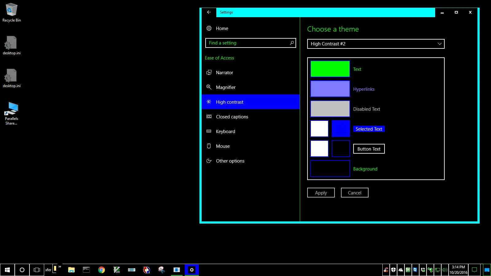
Using Windows Search, just type in the word “contrast”, and one of the results will be “High contrast settings”. Click on that to open the Settings app.

Select one of the available high-contrast themes. The preview window gives you an idea of what the results will be like, but don’t be afraid to click on Apply to make the switch on your system.
You can operate Windows with this high-contrast theme permanently, or just temporarily if you like. You can always switch the theme back to “None” to revert to the previous setting.
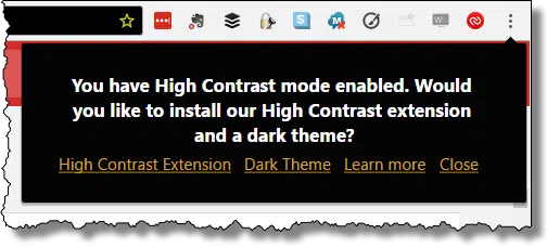
Note: Depending on several factors,websites you visit may now be displayed in a high-contrast mode, or be exactly the same as before. Internet Explorer, for example, displays askleo.com in high contrast when a high-contrast theme is selected. Google Chrome does not, but offers a variety of settings when it detects high contrast.
Play with the settings, and with the browser, to find the mix that works best for you.

Thanks Leo,
I have a problem with red and green and when someone designs a site with red letters on a black background I often can’t make out the letters. I’m going to try this out the next time. A quick work around I’ve used in the pass is to highlight the section I want to read and that changes the colors so I can read.
Ctrl A can save the day.
“perhaps ugly” ??? It makes websites look like badly designed mid-90s pages 🙂 But yes, more readable. Isn’t it possible for Microsoft to program a theme that just makes the darks darker and the lights lighter?
I’ve used the Ctrl+A, mentioned above, sometimes to make the unreadable readable. It’s great, as it’s temporary and only takes a second to implement.